- Client:
- RaiffeisenBank
- Location:
- Saint Petersburg
- Area:
- 196 m²
- Project authors:
- Boris Voskoboynikov, Maria Akhremenkova
- Project group:
- Ekaterina Chernyshova, Yulia Noskova, Karina Ponomar, Ekaterina Epifanova
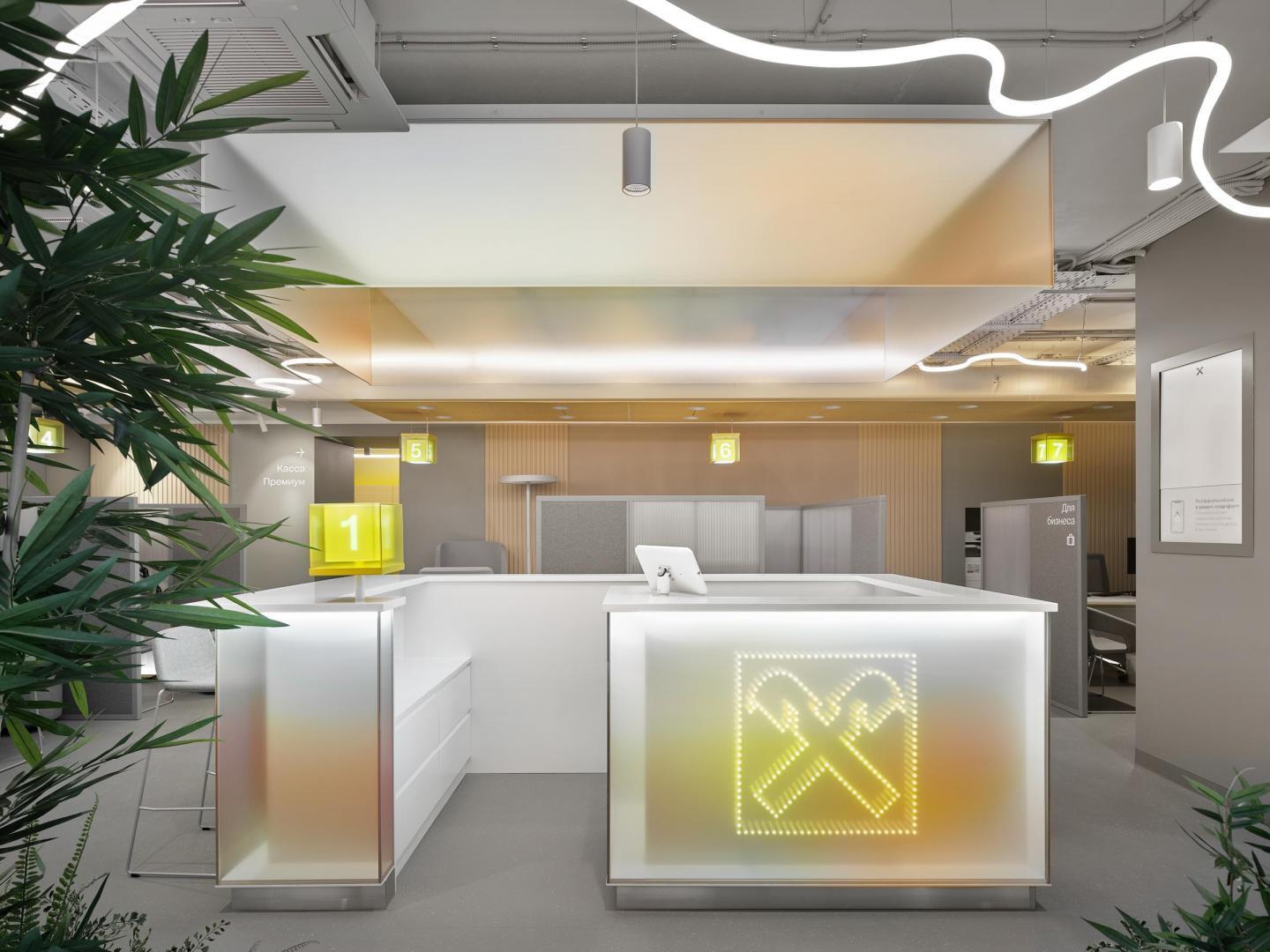
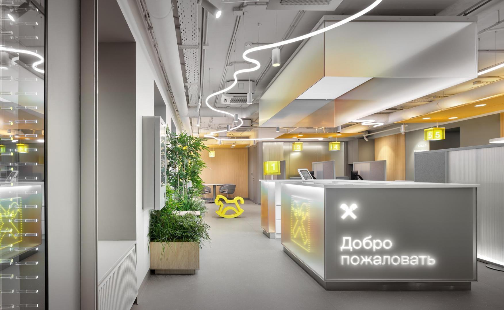
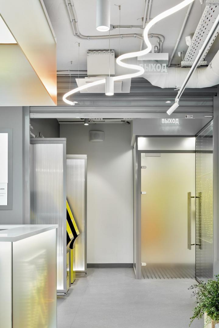
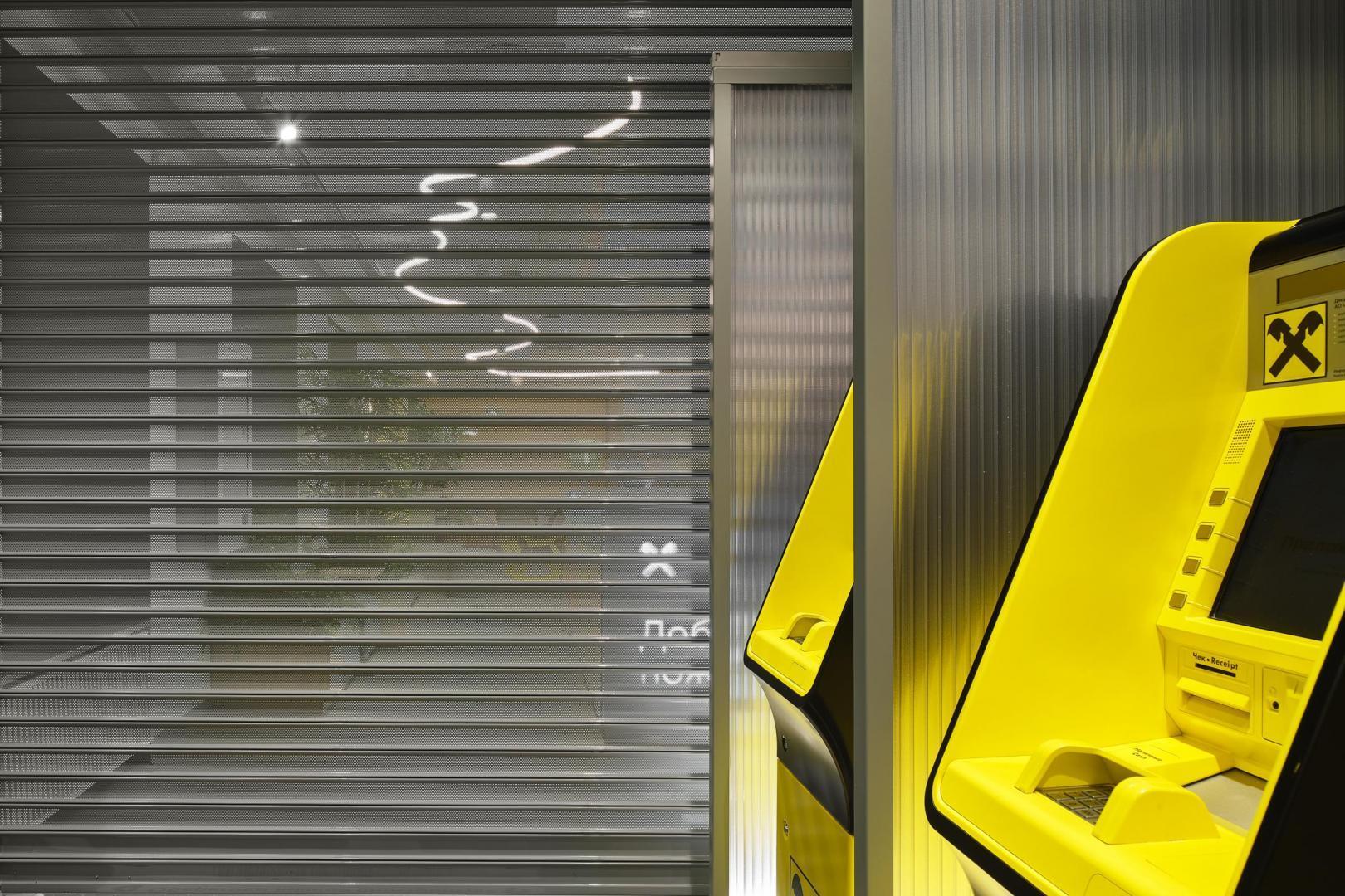
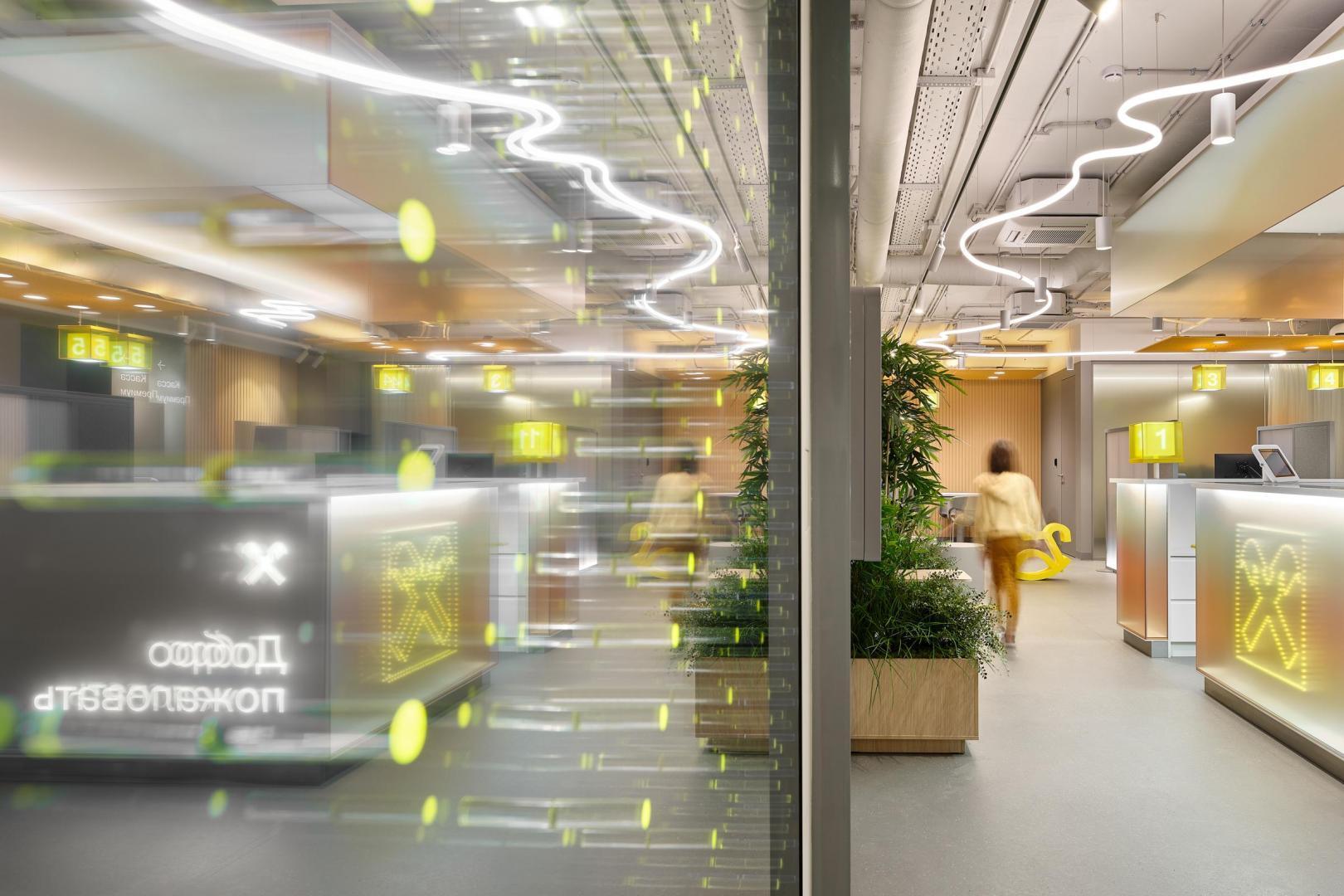
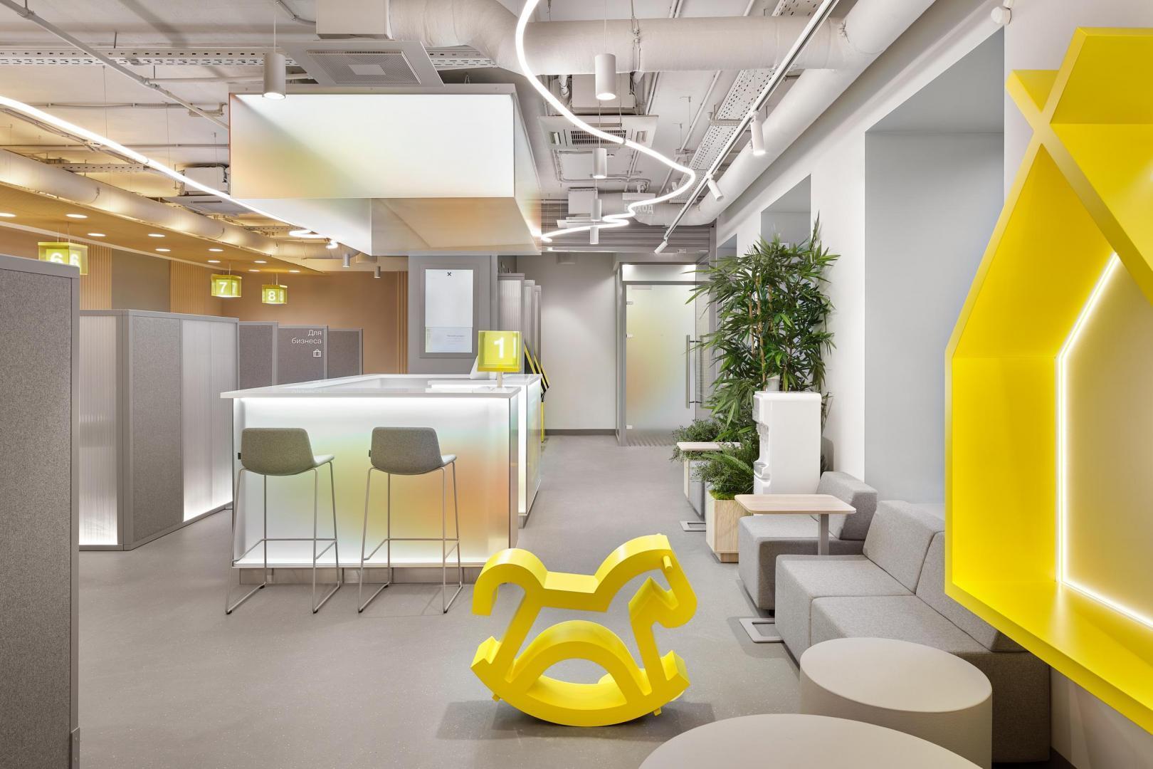
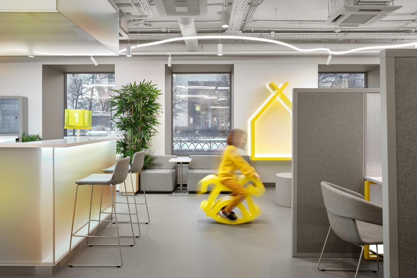
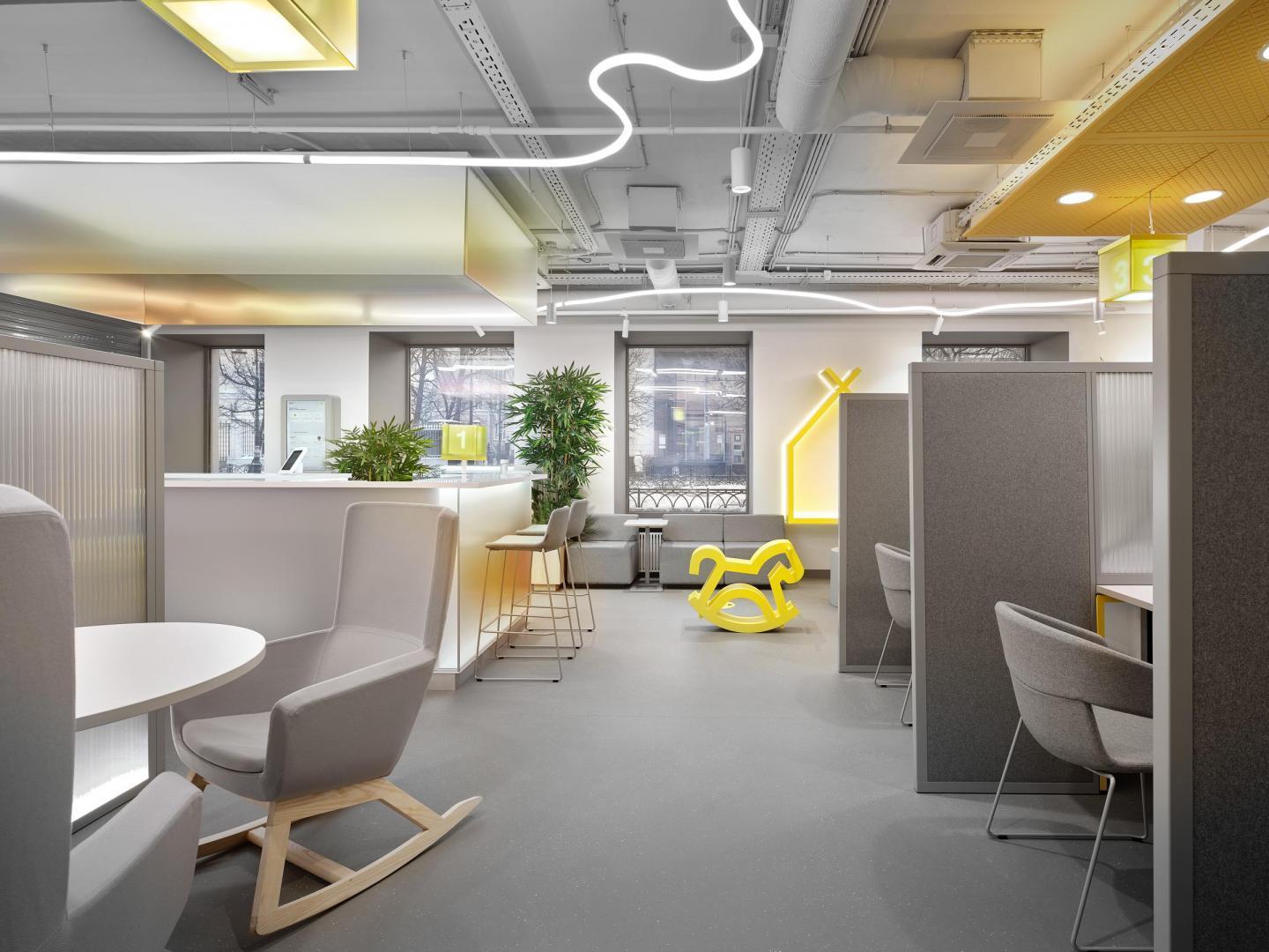
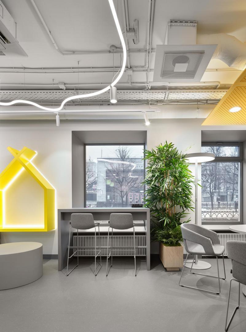
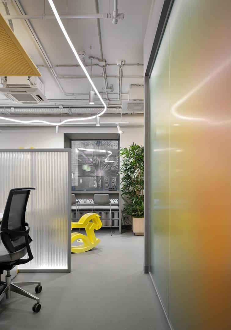
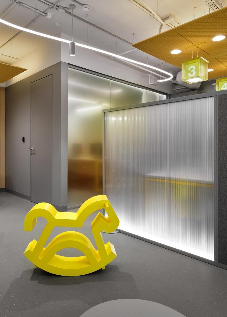
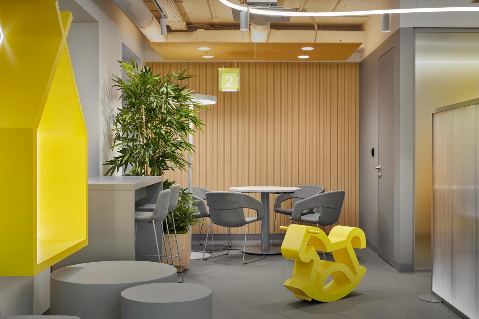
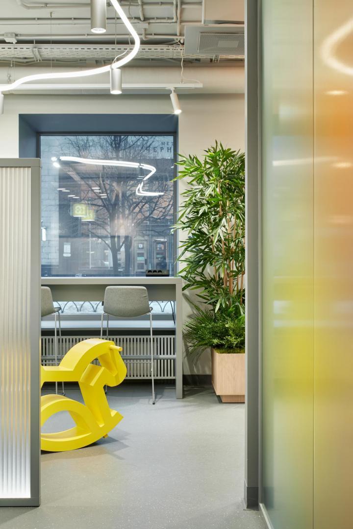
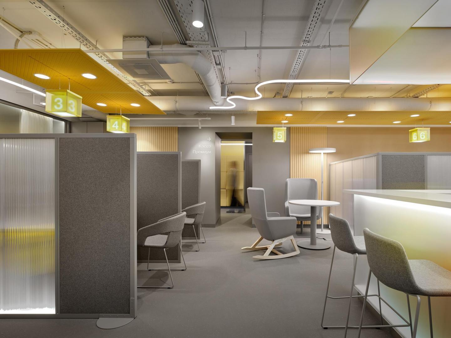
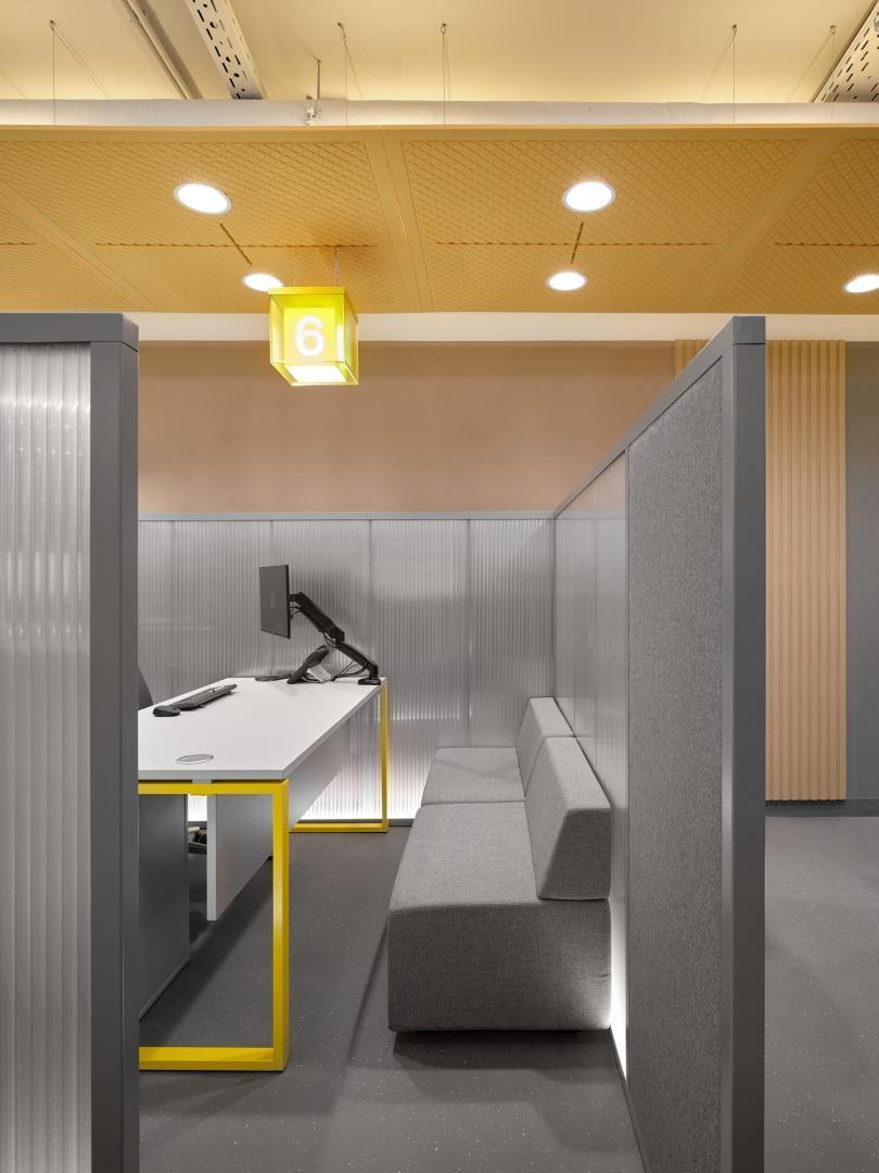
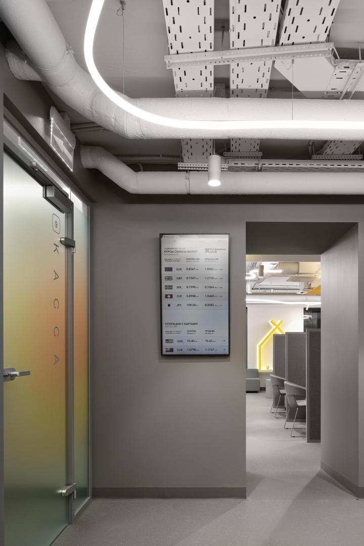
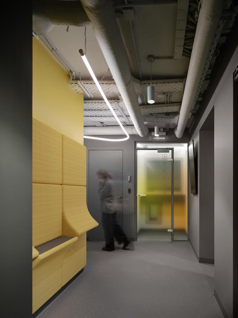
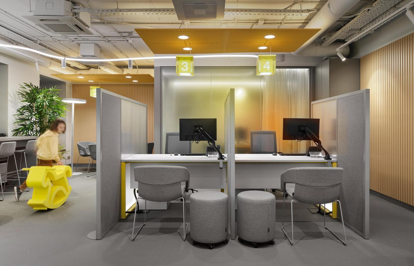
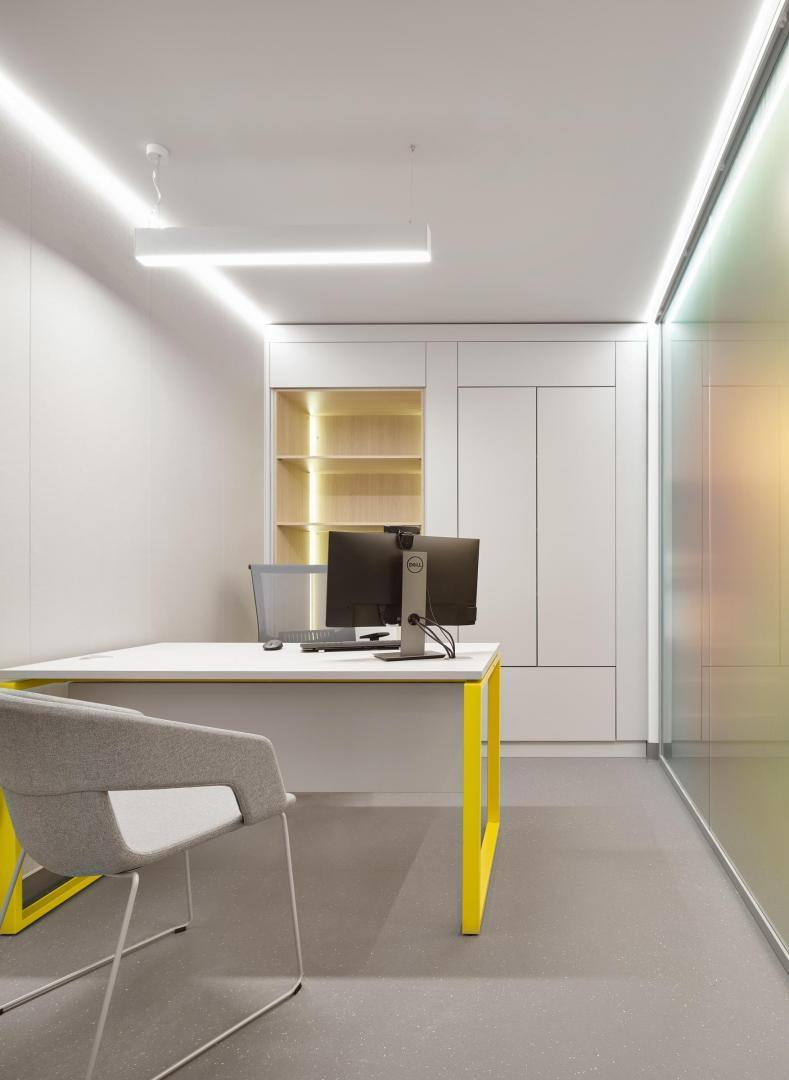
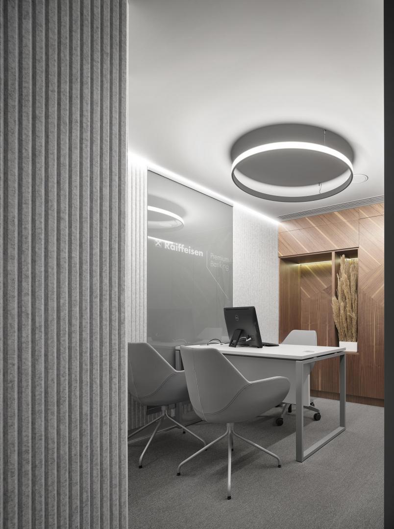
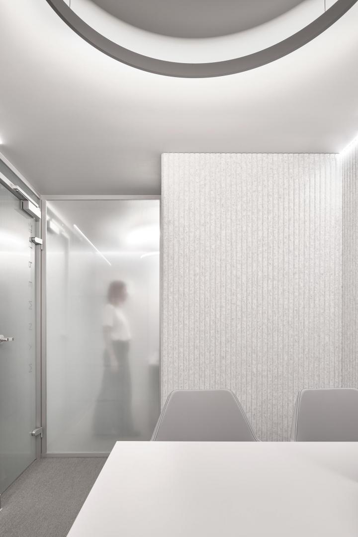
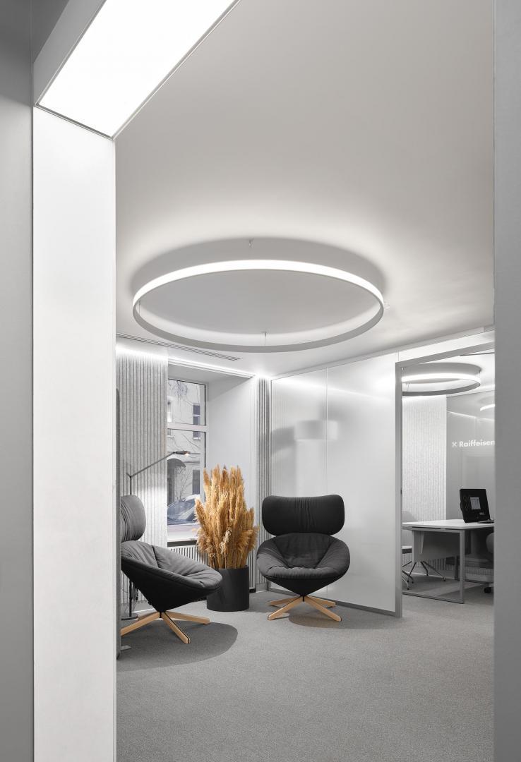
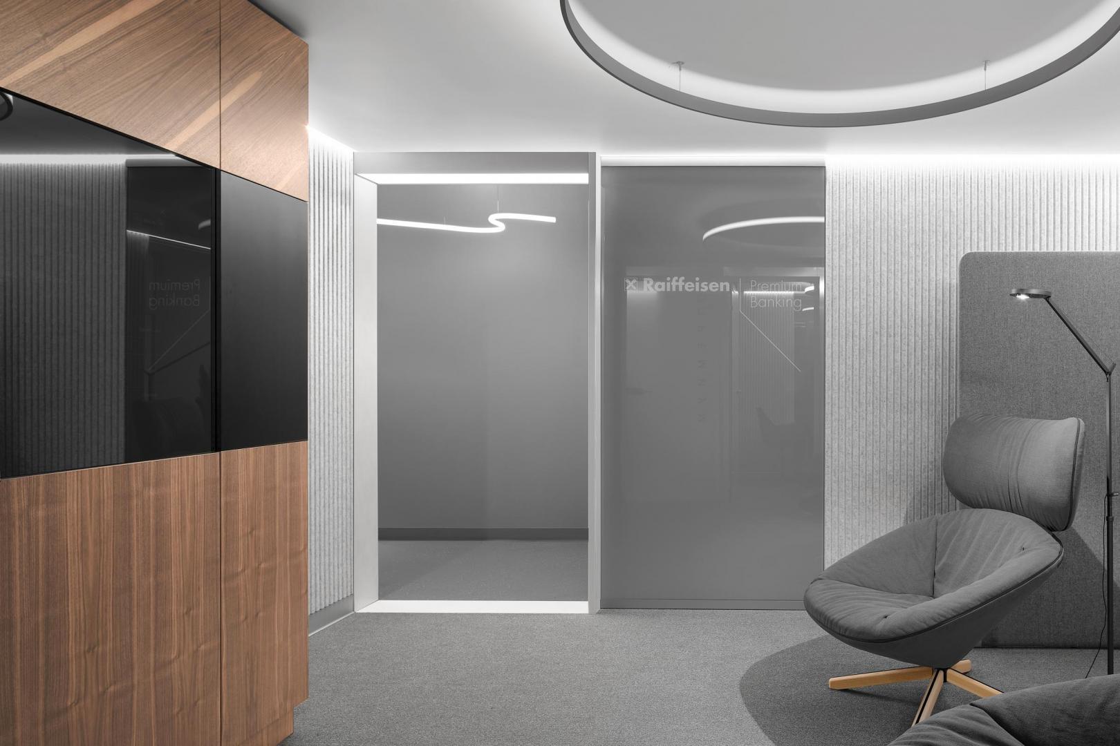
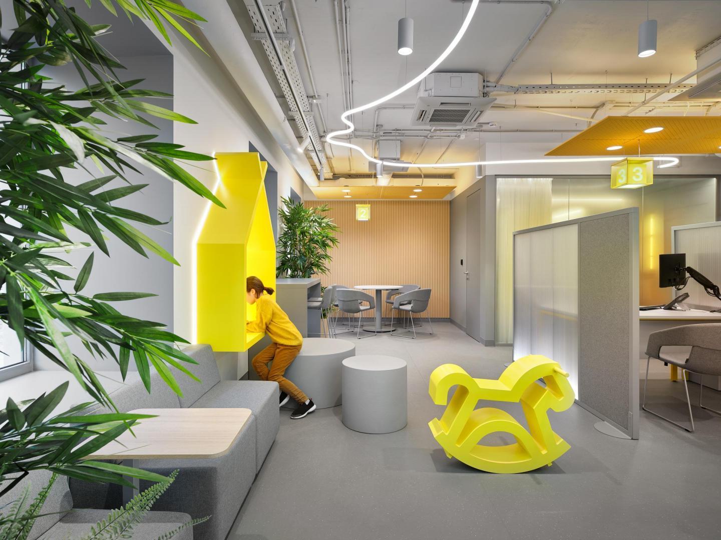
In the world of digital technologies, brick-and-mortar offices are increasingly focusing on face-to-face interaction with a client. Hence in this project it was vital to create a safe and comfortable environment with an emphasis on confidentiality. The ambience of privacy and comfort has become the main idea in the redesigning of Raiffeisen Bank offices. Organization of space The study of customer flows and employee routes resulted in a clear zoning, which makes the use of the branch intuitive. The new design solution provides three conceptual blocks: a self-banking area, a private consultations area and a recreation area. In each of them, special attention is paid to the privacy and maximum comfort of customers, be it an operating hall, a premium customer service area, a waiting area at the cash registers or a mortgage center. For example, it the self-service area welcoming the clients, the ATM unit is equipped with sliding partitions to ensure greater privacy for customer operations; at night, the 24/7 zone is fenced off from the office by retractable vandal-proof roller shutters, showing the waiting and service areas. The large windows show the interior of the branch from the street and invite customers and bypassers inside. Despite the clear and structural layout, the office interior can be adjusted to fulfil new tasks, it is as flexible as possible. The thought out interior, attention to detail tells the client that their most complex and non-standard issues will be all easily solved here. Design idea In this concept of branches, emphasis is put on the privacy of transactions and the secludedness of self-banking and private consulting areas. It is vital that the customer does not feel lost in the open space and can feel comfortable at any location — at an ATM, in the waiting area, at the branch coordinator desk. The priority is to create a cozy space to reinvent the client’s banking experience, immerse them in an informal environment. According to the original plan, the new interior design of the banking network should clearly convey the idea that a client will be at ease here. In the accepted concept of VOX Architects, this idea of "ease and lightness" is manifested at the macro and micro levels. Three levels of "lightness" First of all, a muted colour palette gives an overall feeling of lightness. The architects came up with an idea to soften the harsh contrast of corporate colors: yellow expanded its range from classic lemon to orange and brown, adding in vibration and pulse; black became anthracite, warm gray shades were added. Textured, pleasant to the touch surfaces were introduced into the interior — felt, cork, fabrics, wood — it makes the branch interior more clear and pleasant at the tactile level. Acoustic plaster, sound absorbing partitions made of cellular polycarbonate and soft panels, furniture made of acoustic materials - all these solutions subtly provide a sense of privacy and security. The traditional interior details received new emotional connotation, which implements the idea of "lightness and easy" as well. Staying in the waiting area of the operating hall is more like a pleasant wait for a flight: here one can look through the large windows, monitor the changing numbers on the board and soft lighting signals when calling a client. In the premium area located in the back of the branch, a customer can relax in a rocking chair while tackling their urgent financial issues. Accent touches of the light line on the ceiling perform as intuitive navigation: the line becomes active over the reception area and service areas. In common areas, dim lighting is provided by floor lamps with two-way illumination. In a combination with light sources with an anti-blind grating built into engineering systems, they are well combined with accent lighting in work areas. Special attention is paid to the non-standard approach to standard solutions, and this reflects the ideology of the bank. At the entrance to the office, customers see a reception desk with the bank's logo with the image of two crossed horses' heads: the sign is on the cross-section of glowing acrylic tubes inside a transparent box with a splash-effect and becomes a light art object. The cross-reflections add both depth and lightness, return it its magical essence – the company's logo derives from the Nordic tradition of using this symbol on the gables of roofs to protect inhabitants from any trouble. Key details await visitors on the entire route through the new office, suggesting that each feature is carefully elaborated. Such are the artifacts in the children's area for the younger visitors — a rocking horse and a drawing stand with built-in lighting, that were specially designed for the branches network. The design resembles the facade of a typical timber-framed "Saxon" house, a hallenhaus, with a gable cross (two crossed wooden horse heads) on the frontal, which is the company's logo. This space can serve both as a recreation area and a photo zone. Integrated greenery spots are provided in the waiting area; to make the waiting comfortable, the branch coordinator's desk is equipped with a coffee point; the cash desks have wall panels with seats and a table to conveniently spend a short waiting period. In places for digital services consultations and in the recreation area there are partitions with lounge furniture, rocking chairs and round tables with lounge chairs. The interior is also designed to be comfortable for the staff: all the office equipment is built into the architecture, the back office is a recreational area where employees can relax on pillows on a wide windowsill or in a hammock, and a small dining room is a perfect spot to have a snack or drink coffee.
- Status:
- Implemented, 2021
- Photos:
- Sergey Ananyev, Egor Slyzniak
